Blog Sidebar Strategy: Turn Visitors Into Customers
Your blog sidebar strategy might be the most overlooked conversion tool on your website. I’ve watched too many small business owners treat their sidebar like a digital junk drawer – stuffing it with random widgets, outdated event calendars, and those “recent comments” boxes that showcase spam from five years ago.
Here’s the thing: your sidebar gets seen by nearly every visitor who reads your blog posts. That’s prime real estate you’re probably wasting right now.
Let me walk you through how to turn that neglected space into a customer-generating machine without coming across like a pushy used car salesman.
Why Your Blog Sidebar Strategy Matters More Than You Think
Most business owners I talk to focus all their energy on writing great blog content. And sure, that matters. But what happens after someone reads your brilliant post about solving their exact problem?
If your sidebar is cluttered with useless widgets, they bounce. If it’s empty, they bounce. If it’s strategically designed to guide them toward your services – now we’re talking.
Think about it: someone just spent three minutes reading your advice. They’re thinking, “This person knows what they’re talking about.” That’s the perfect moment to show them how they can work with you.
Your sidebar should be like a helpful store employee who appears at just the right moment with exactly what the customer needs next.
The Biggest Blog Sidebar Mistakes I See
Before we fix your sidebar, let’s talk about what’s probably broken right now. These mistakes are so common, I could probably guess what’s in your sidebar without looking.
The “Everything But the Kitchen Sink” Approach
I’ve seen sidebars with 15 different widgets. Social media feeds, tag clouds, archives going back to 2018, random badges from organizations nobody remembers joining. It’s overwhelming.
Your visitors’ brains shut down when faced with too many choices. They came to read about solving a problem, not to explore your entire digital life story.
The “Set It and Forget It” Calendar
Nothing screams “abandoned website” like an events calendar showing last month’s webinar or that networking event from 2023. If you’re not actively maintaining something in your sidebar, remove it.
The “Look How Popular I Am” Widgets
Social media follower counts, recent comments sections, “most popular posts” from three years ago – these don’t build trust if the numbers are low or the content is stale.
Instead of trying to prove you’re popular, focus on proving you can solve their problems.
Strategic Elements That Actually Convert Readers
Now let’s talk about what should go in your sidebar. These elements work because they meet people where they are in their customer journey.
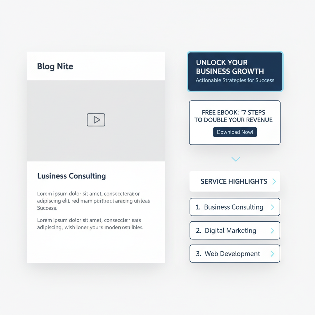
A Clear Value Proposition
Right at the top of your sidebar, tell people exactly what you do and who you help. Not in corporate speak – in plain English.
“I help contractors get more leads through better websites” beats “Leveraging digital solutions for construction industry growth” every single time.
Lead Magnets That Match Your Content
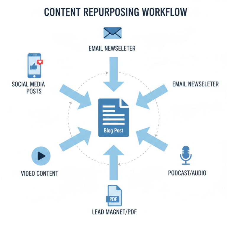
This is where your blog sidebar strategy gets really smart. If someone just read your post about email marketing, offer them a free email template. If they read about project management, offer a project checklist.
The key is relevance. Don’t offer the same generic ebook to everyone. Match your offer to what they just consumed.
Service Highlights, Not Full Menus
Pick your top 2-3 services and highlight those. Don’t list everything you’ve ever done for anyone. Focus on what most of your ideal clients actually buy.
Use benefit-focused language: “Website Redesigns That Actually Get You Customers” instead of “Web Design Services.”
The Psychology of Strategic Sidebar Design
Here’s something most business owners miss: your sidebar placement matters as much as your content. People read in predictable patterns, and you can use that to your advantage.
Place your most important conversion elements where eyes naturally go. That’s usually the top of your sidebar and anywhere that aligns with natural reading breaks in your content.
Also, people are more likely to take action after they’ve consumed valuable content. They’re in a “this person is helpful” mindset, which makes them more receptive to your offers.
But timing matters. Don’t hit them with a sales pitch in the first paragraph. Let them get value first, then show them how to get more.
Mobile-First Sidebar Strategy
Here’s a reality check: most of your readers are on mobile devices. On mobile, your sidebar usually appears at the bottom of your post, after all your content.
This actually works in your favor. By the time mobile readers reach your sidebar, they’ve consumed your entire post. They’re primed to take the next step.
But keep mobile limitations in mind. Long forms don’t work well on phones. Complex navigation gets frustrating. Stick to simple, thumb-friendly calls to action.
Consider what works best on mobile: one-click email signups, clear phone numbers for calls, simple contact forms with just 2-3 fields.
Testing What Actually Works for Your Business
Here’s where most advice falls apart: every business is different. What works for a consultant won’t work for a retail store. What works for a restaurant won’t work for a software company.
Start with the basics I’ve outlined, but then pay attention to your analytics. Which sidebar elements get clicked? Which lead magnets get downloaded? Which service pages get the most traffic from your blog?
Don’t just guess – measure. And don’t try to test everything at once. Change one element, watch what happens for a few weeks, then try something else.
If you’re just getting started with tracking, focus on simple metrics: email signups, contact form submissions, and clicks to your service pages. That’s enough to tell you if your blog sidebar strategy is working.
Integration with Your Overall Content Strategy
Your sidebar shouldn’t exist in isolation. It needs to work with your overall content strategy, not against it.
If you’re following a strategic approach to blog topics that drive business results, your sidebar should reinforce those same business goals.
Writing about common customer problems? Your sidebar should offer solutions. Publishing educational content? Your sidebar should show how readers can go deeper with your help.
This is also where smart content planning pays off. When you know what content is coming, you can design sidebar elements that support multiple posts instead of constantly changing things.
Common Questions About Blog Sidebars
Should I include social media links?
Only if you actively maintain those profiles and they support your business goals. A LinkedIn profile that you update regularly? Sure. A Twitter account you haven’t touched in six months? Skip it.
What about email signup forms?
Absolutely, but make the offer specific. Instead of “Subscribe to my newsletter,” try “Get my weekly tips for [specific audience] delivered to your inbox.”
How often should I update my sidebar?
At minimum, quarterly. But if you’re running seasonal promotions or launching new services, update more frequently. Just don’t change things so often that repeat visitors get confused.
Should I use the same sidebar on every post?
Not necessarily. If you have different types of content for different audiences, consider customizing your sidebars accordingly. But don’t overcomplicate it – having 2-3 sidebar variations is plenty.
Making It Happen (Without Overthinking It)
Look, I know this might feel overwhelming if you’re already struggling to keep up with regular posting. But here’s the good news: you don’t need to redesign everything at once.
Start simple. Pick one element from this post and implement it this week. Maybe it’s cleaning out the clutter, or adding a simple lead magnet, or just writing a clear description of what you do.
Remember, the goal isn’t perfection. It’s improvement. A sidebar that’s 50% better than what you have now will generate more leads than a perfect sidebar you never actually create.
If you’re already following efficient blogging practices, adding strategic sidebar elements should feel like a natural next step, not another overwhelming project.
The Bottom Line on Blog Sidebar Strategy
Your blog sidebar is working 24/7, whether you’re paying attention to it or not. The question is: what kind of work is it doing?
Is it cluttered and confusing visitors? Is it empty and wasting opportunities? Or is it strategically designed to turn readers into customers?
Most small business owners I work with are surprised by how much difference a well-designed sidebar makes. It’s not about being salesy – it’s about being helpful at exactly the right moment.
Your readers just invested time in your content because they have a problem you can solve. Your sidebar should make it easy for them to take the next logical step toward working with you.
That’s not pushy. That’s just good business.
So take a look at your sidebar right now. What story is it telling about your business? What action is it encouraging? And most importantly – is it helping the people who need your services actually find you?
Your website should be working harder for you, and that includes every pixel of your sidebar. Make it count.